Smashing Conference Barcelona
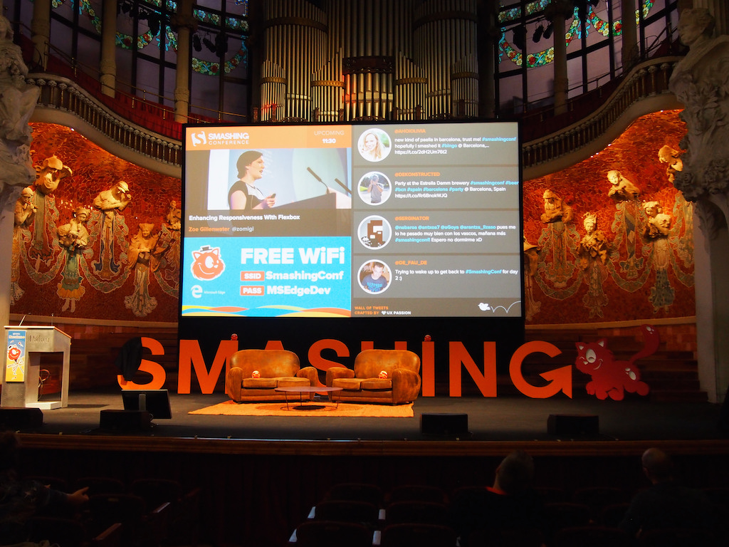
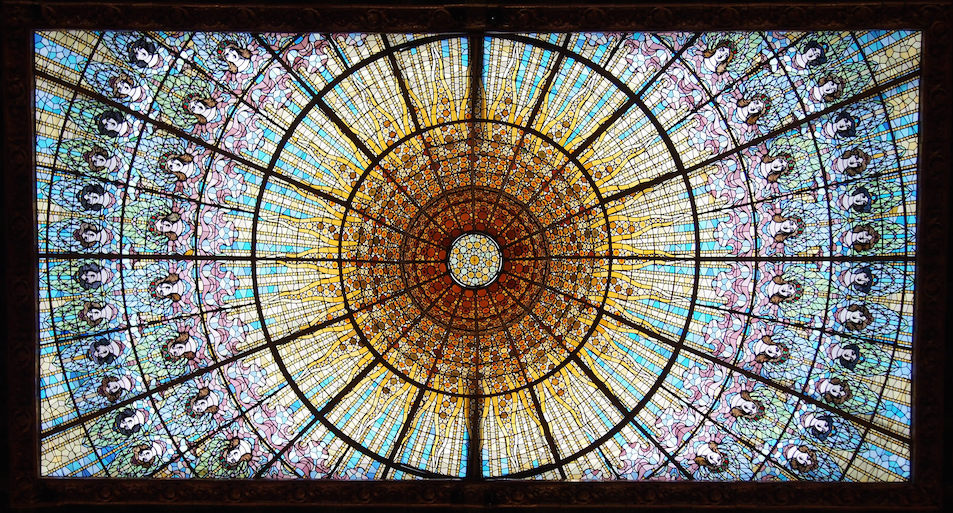
Towards the end of October I attended the Smashing Conference in Barcelona. Smashing is a publishing company that provide many resources for web designers and developers in the international community. The conference was absolutely brilliant! The workshop and all the speakers were great. The community in general was really positive and friendly. To top it off, the venue was simply SPECTACULAR! The event was hosted in the famous building, Palau De la Musica Catalan designed by architect architect Lluís Domènech i Montaner.
There were loads of interesting presentations at the conference, from people of various different aspects of web development and design in general: web, graphics and font designers, front and back-end developers, marketing people, people with a background in network performance and more.
As a front-end developer thinking more along the aspects of what is valuable for me at this point in my career, I had three main take-aways from the conference, that I wanted to learn more about and start using. They are FlexBox, SVG and BEM.
##FlexBox Pre-conference I attended a full day workshop on CSS3 for Response Web Design by Andy Clarke from Stuff and Nonsense. Andy explained brilliantly about the pros and cons of using FlexBox to make developing sites to be responsive. Floating items left and right and getting layering to work has been quite a challenge in the past. FlexBox simplifies layout and positioning. The way it is designed to work has a very simple left to right, top to bottom flow of ‘containers’. These can be easily reversed. When a page is too narrow for them to be placed side-by-side then they simply resort to a stacked order. Containers can be given priorities so that the stacking retains emphasis on the main content of a page.
All the FlexBox concepts Andy covered in the workshop were then reiterated and added to by Zoe Gillenwater in her presentation on Enhancing responsiveness with FlexBox.
While the workshop wasn’t as hands-on as I had hoped, it was certainly taught in a way that makes me feel like I can go away and start to implement the concepts I was taught. The additional bonus, is that because I haven’t developed set workflows already in positioning and finding crazy workarounds for what theoretically should be simple solutions, the migration towards the use of FlexBox won’t require me to break any pre-formed habits. Which also allows me to be more open-minded in the way the set of tools are used.
##SVG SVG are Scalable Vector Graphics, and a means of including images in your site. As a quick summary there are two main styles of images: raster and vector. Raster means that every pixel in the image is a separate dot with information about colour. This means an image has lots of information stored in it and can create a large file size. But also, if you stretch the image to be bigger than its original size, it turns out all pixelated and blocky. A vector image uses formulas to create shapes. Each time an image is changed in size the formulas recalculate all aspects of the image so that something like a curve, remains a perfect curve even when large. Because an SVG images simply contains sets of rules for colours, shapes and positioning. The file size is typically smaller than that of a raster image. Smaller image files allow websites to load quicker, which is a definite bonus in the world of web. (It’s important to realise that there is still a place for raster based graphics, each style has its own pros and cons - and the use of one of the other requires consideration of the type of image and its purpose on the site)
Icons on a website have historically been included in one of two ways 1) as an image file and 2) as an icon font. SVG as a icon can reduce the file size and number of required HTTP requests when compared to the use of an image file. In terms of icon fonts, it is often preferable to use SVG rather than icon fonts because then you won’t have things like horses appearing instead of stars in the event that the web fonts has not loaded correctly or are still in the process of loading. Additionally, there are fewer required HTTP requests and less data to be transferred, also improving site speed/performace.
The additional bonus of SVG files is that they can be animated! Once I learn how to create and use SVG, then I might start to discuss the animation of them. So stay tuned for that!
##BEM BEM, Block Element Modifier isn’t a tool, rather a naming convention that aims to provide common structure, as CSS is traditionally not very organised. It has gained recent popularity and is about the use of a common structure when naming rules in a css file. The reason for using a naming scheme is to make the stylesheet more readable. Having taught Computer Science and programming for eight years. The concept of BEM is something I very much agree with. A professional responsibility of any developer in any programming language is to ensure that their code is as readable as possible - both for themselves, their team and future developers.